

Almost Home
Visual Identity for a Novel
This project explores the emotional architecture of a novel titled Almost Home, a story about belonging, memory, and the quiet language of food.
Our studio was invited to create the visual universe for this book: a world built not around spectacle, but around softness—slow light, subtle gestures, and the intimacy of everyday rituals.
We designed a hardcover edition that reflects the novel’s core themes: rootedness, silence, and seasonal transformation. The palette—deep blue and ripe orange—evokes twilight in a small countryside kitchen. The symbolic vase motif, repeated throughout, speaks to the narrative’s floral imagery and the characters’ emotional resilience.
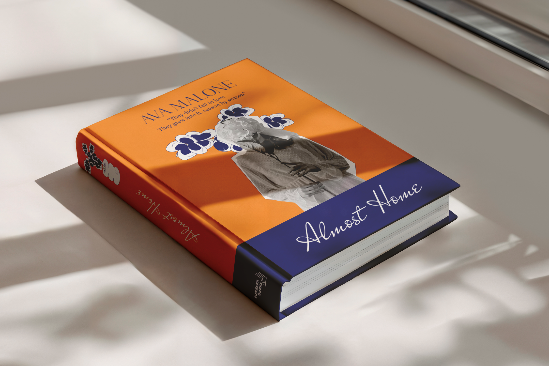

Typography choices were guided by contrast: a serif typeface to ground the narrative in literary weight, and a handwritten script to capture the personal, almost whispered tone of the storytelling. The quote on the cover—“They didn’t fall in love. They grew into it, season by season.”—was selected as a distilled emotional anchor for the book.
The visual system extends beyond the book cover. We developed interior design details, a launch poster series, and a collection of house posters inspired by the novel’s emotional and symbolic universe—each piece evoking the recurring themes of presence, stillness, and transformation.
In a publishing landscape often defined by noise, Almost Home offered us the rare opportunity to design for stillness. To create not just a cover, but a feeling.


