
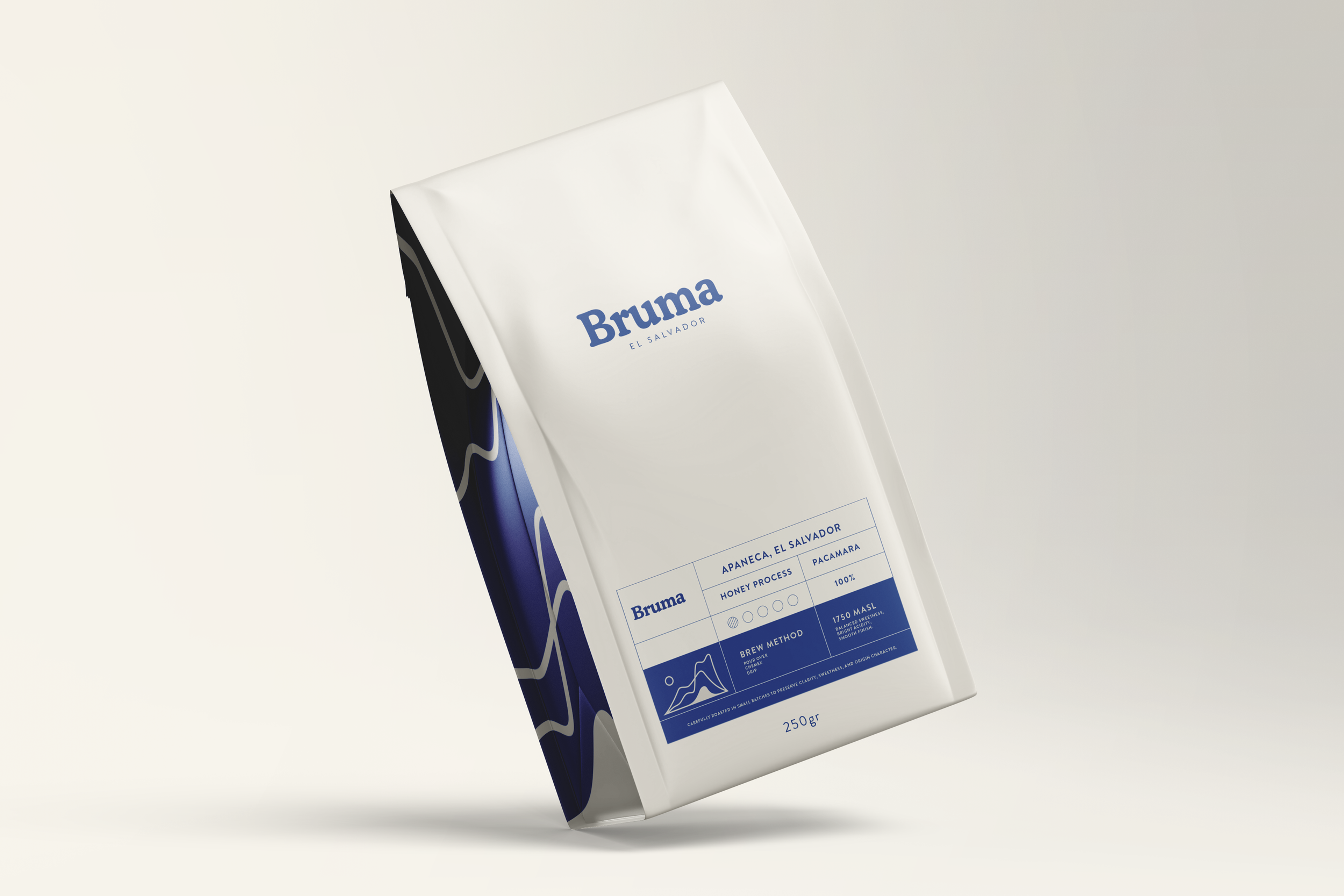
Coffee Brand Identity & Packaging Design
Bruma is a specialty coffee branding concept inspired by the volcanic highlands and mountain mist of El Salvador.
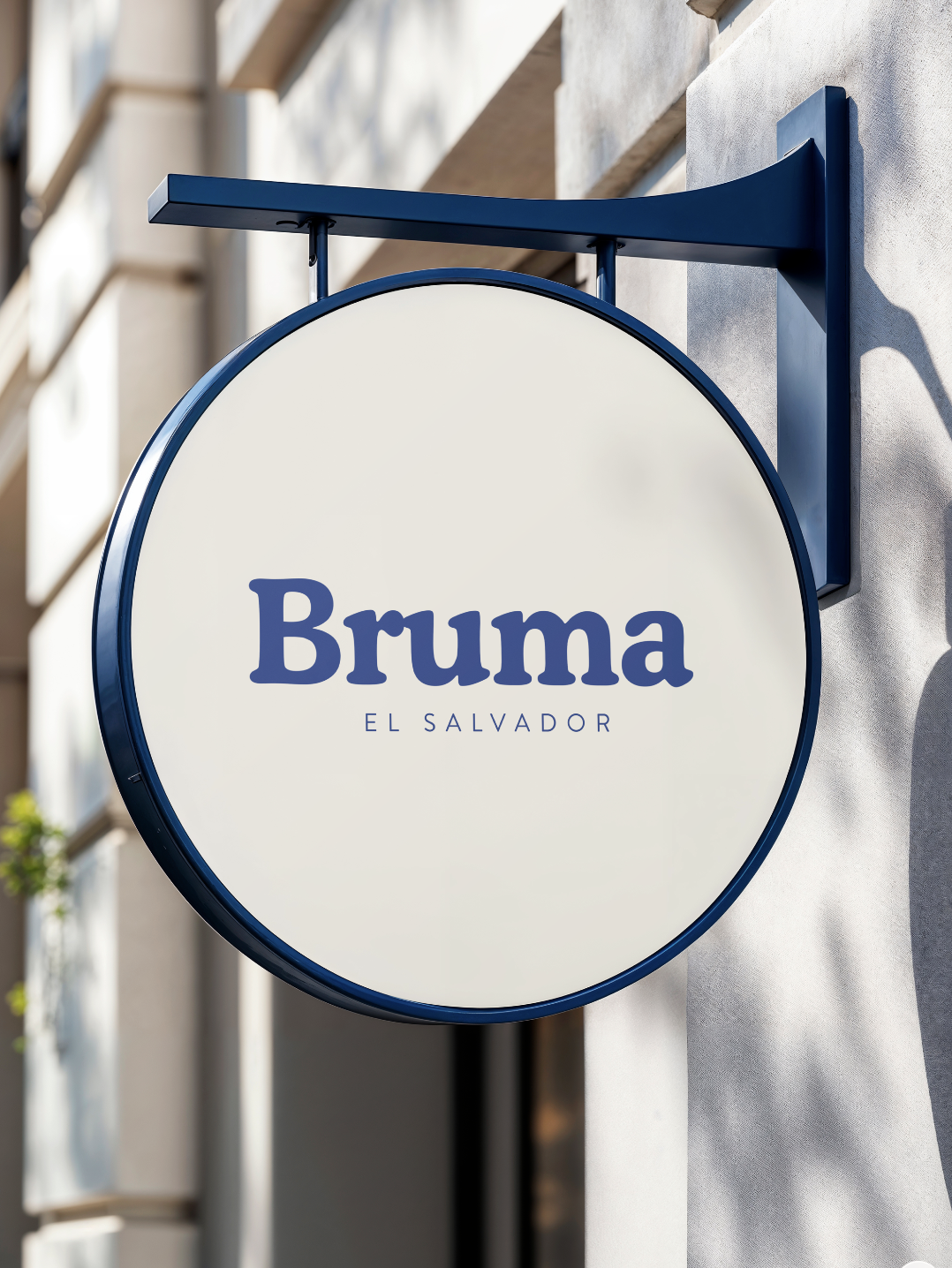
Built around the idea of quiet luxury and atmospheric calm, the identity moves away from traditional rustic coffee aesthetics and instead embraces a more editorial, contemporary visual language. The result is a system designed to feel equally at home in a concept store in Copenhagen, a minimalist café in Tokyo, or a specialty coffee bar in Mexico City.
The name “Bruma” — meaning mist or fog in Spanish — became the foundation of the brand universe: soft landscapes, volcanic altitude, slow rituals, and restrained sophistication.
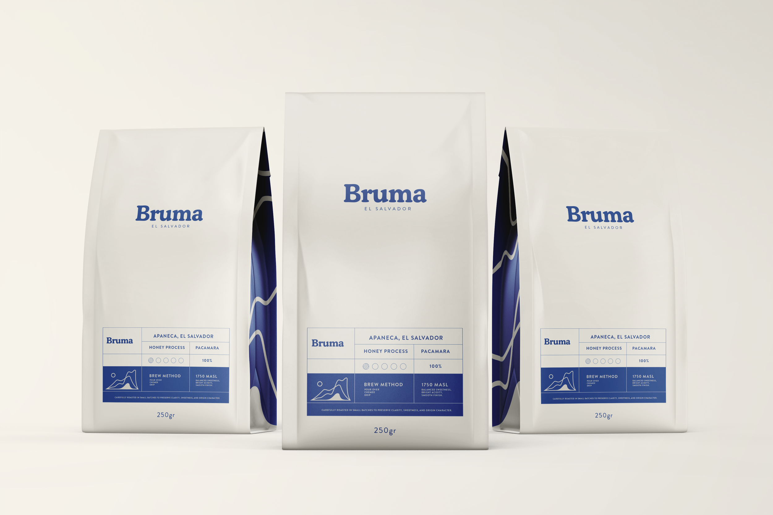
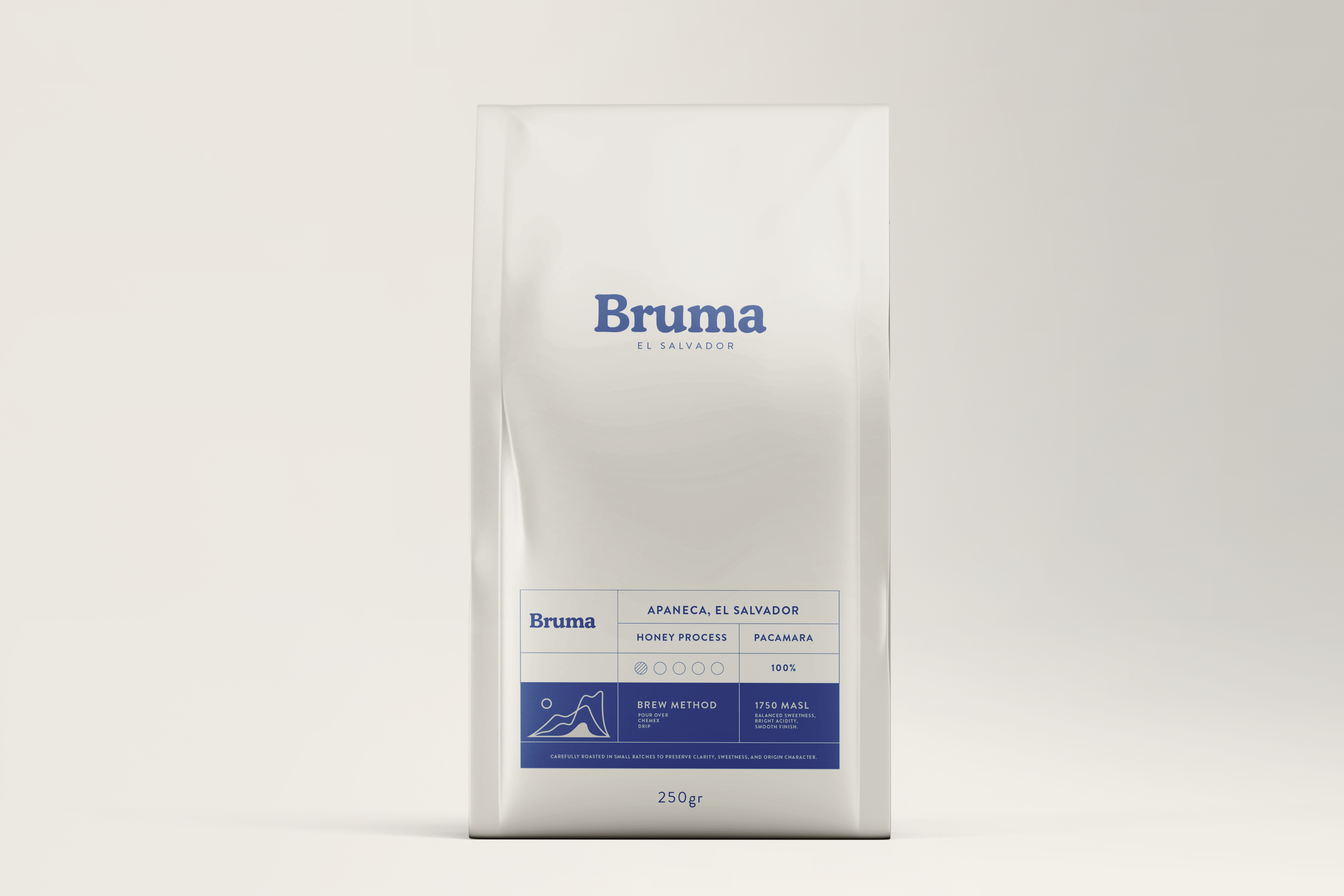
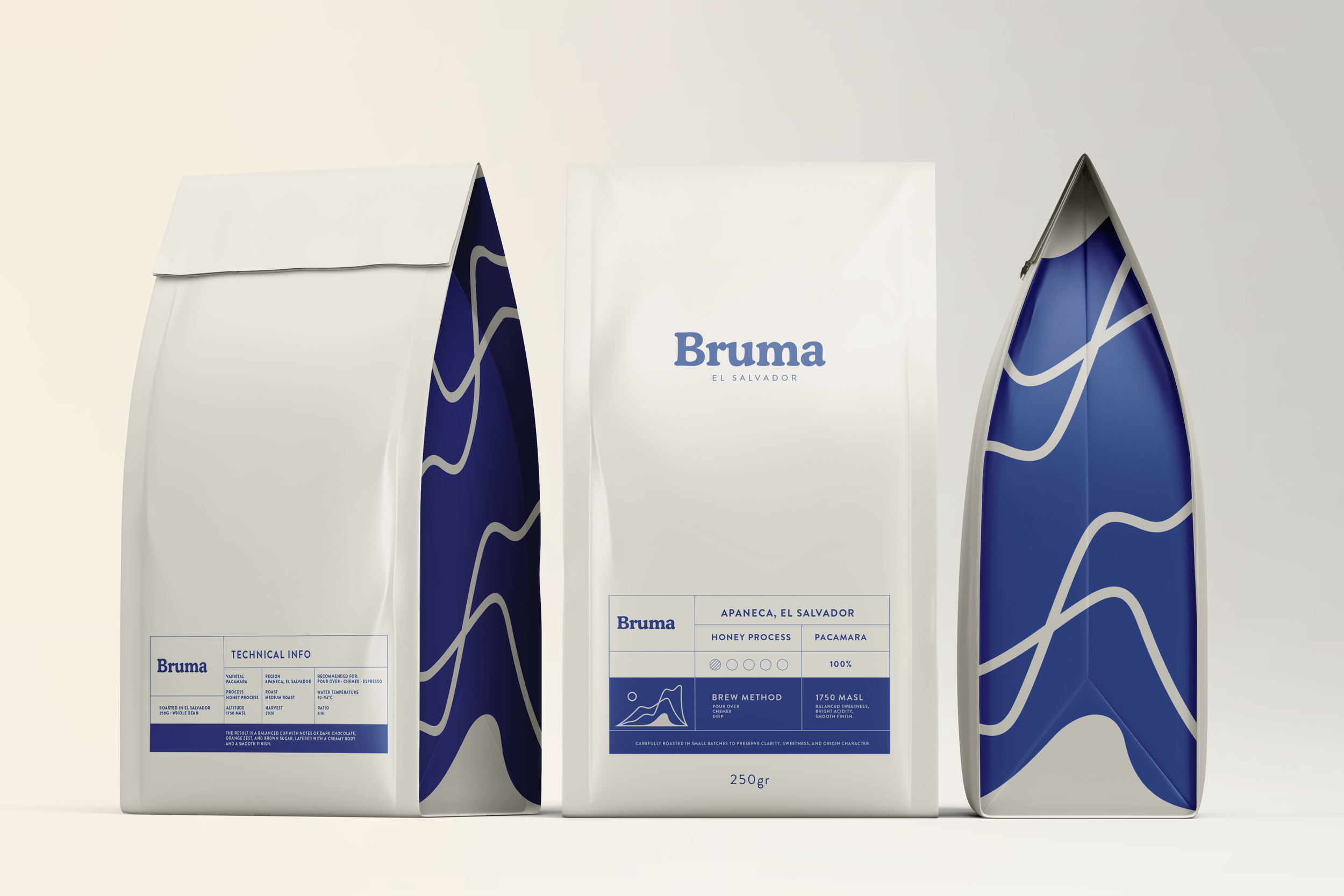
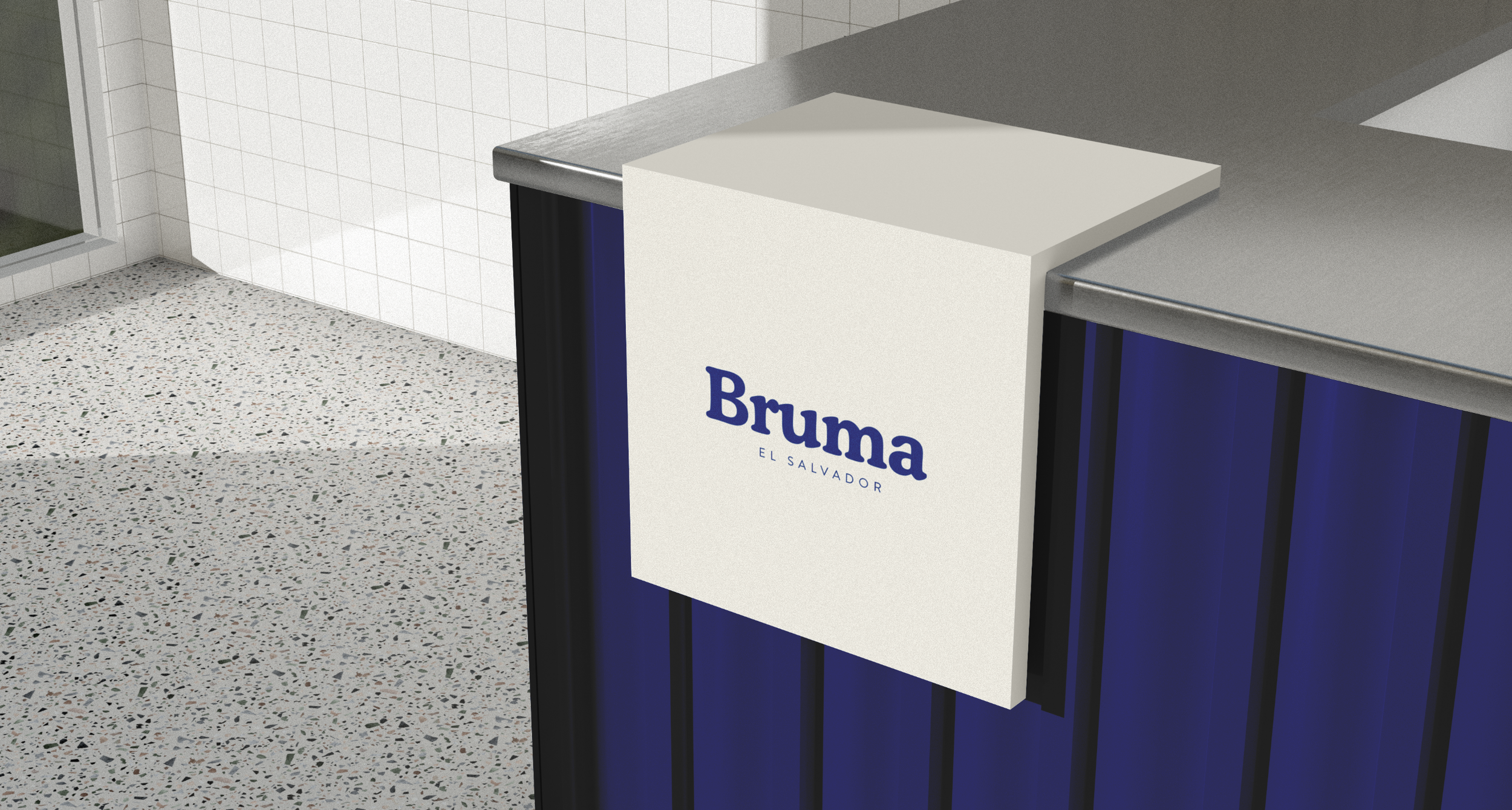
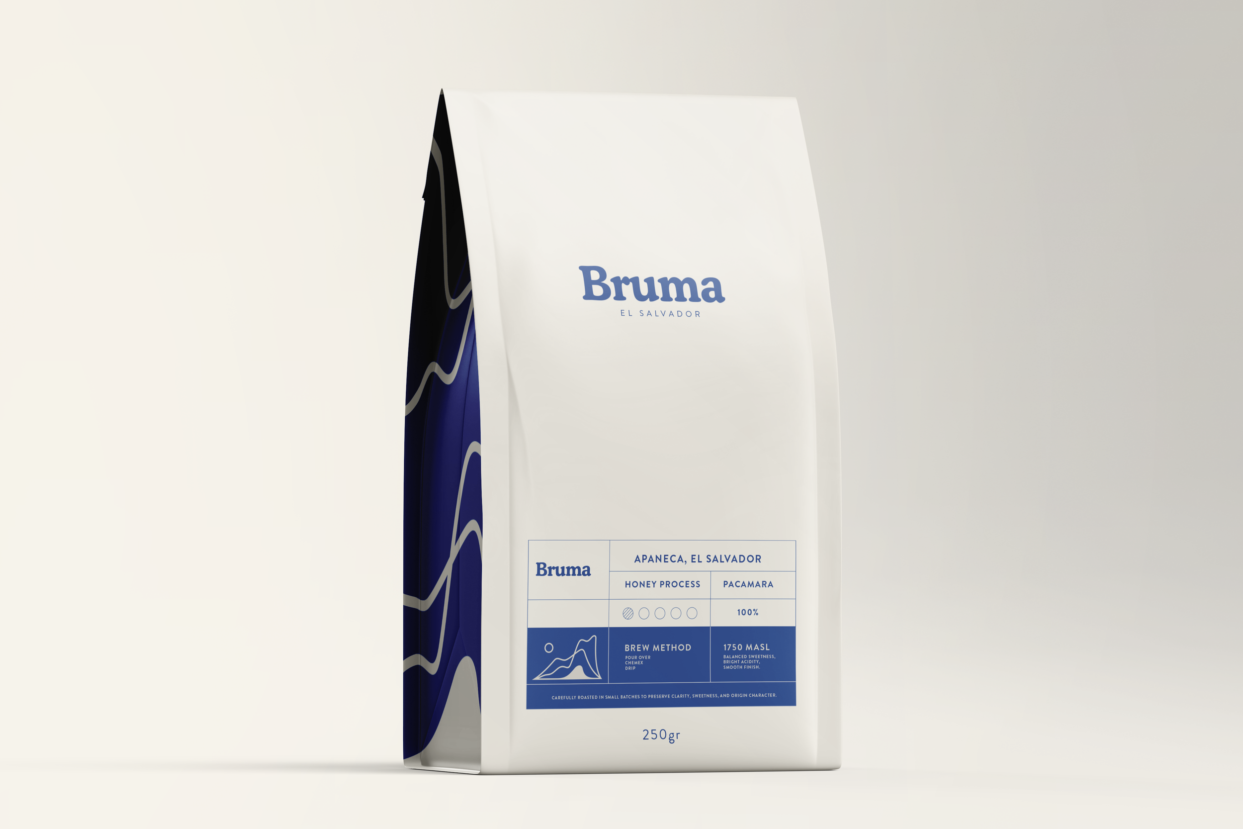
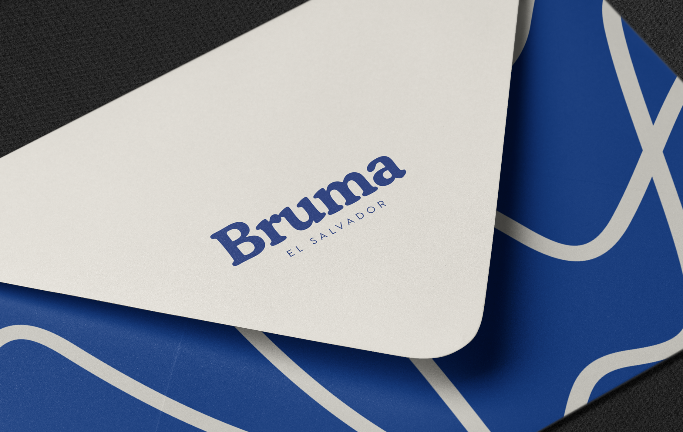
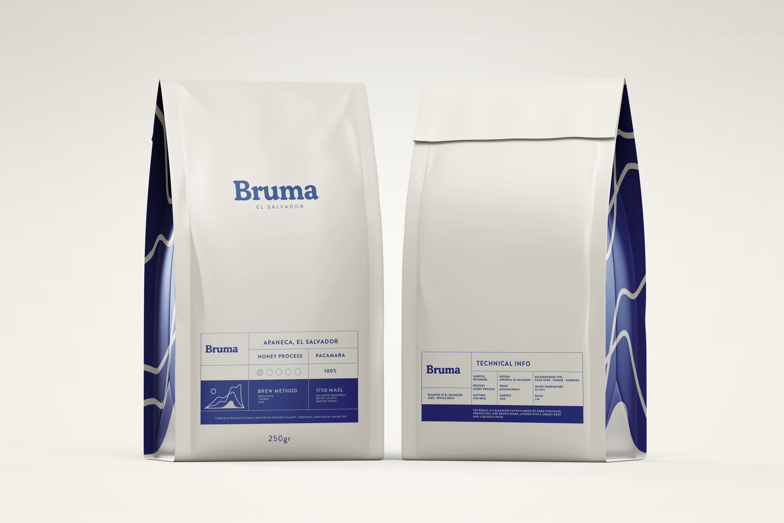
The visual identity combines bold serif typography with structured technical layouts and organic contour-inspired graphics, creating a balance between precision and atmosphere. A signature deep blue paired with warm bone neutrals reinforces the sense of depth, calmness, and premium quality across the entire packaging system.
Designed for high-altitude varietals such as Pacamara, Geisha, and Peaberry, the packaging focuses on clarity, origin, and ritual rather than visual excess. Inspired by contemporary specialty coffee culture, wine labels, niche fragrance packaging, and editorial design systems, Bruma positions Salvadoran coffee as both a product and a cultural object.
Bruma
Project Details
-
Specialty Coffee
-
Coffee Brand Identity & Packaging Design
-
2026
-
El Salvador