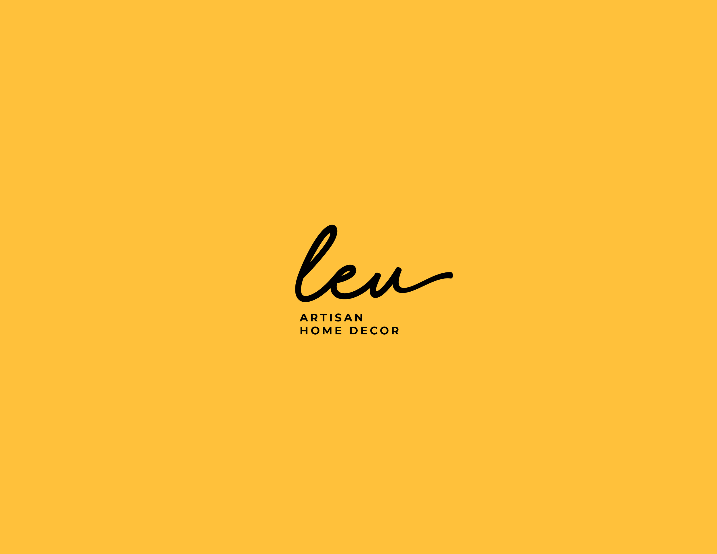
Visual Identity
When Lorena and Eugenia commissioned us to develop the visual identity for their new project, the full scope of the challenge was not immediately apparent.
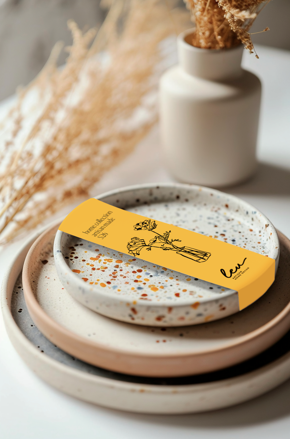
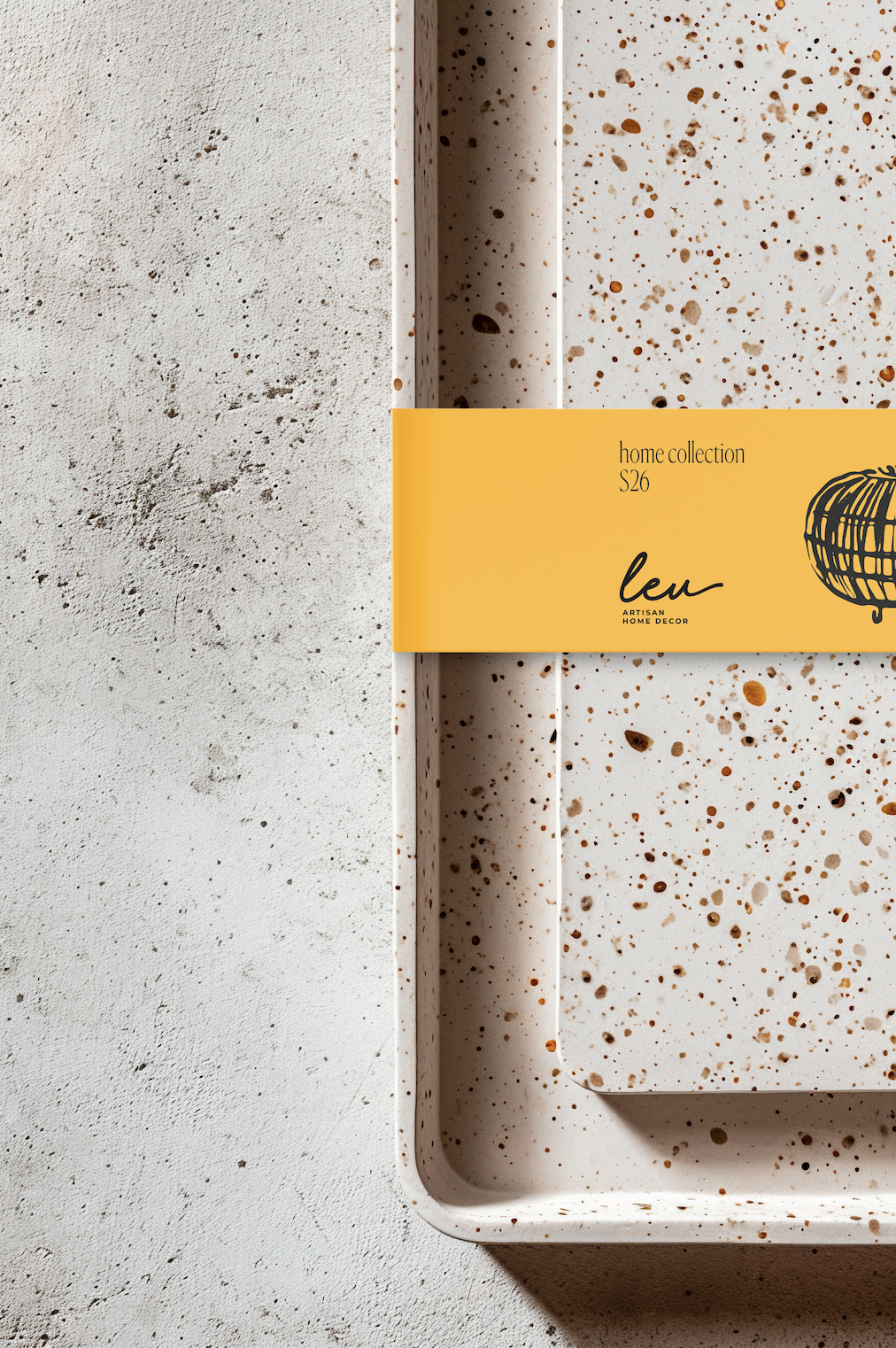
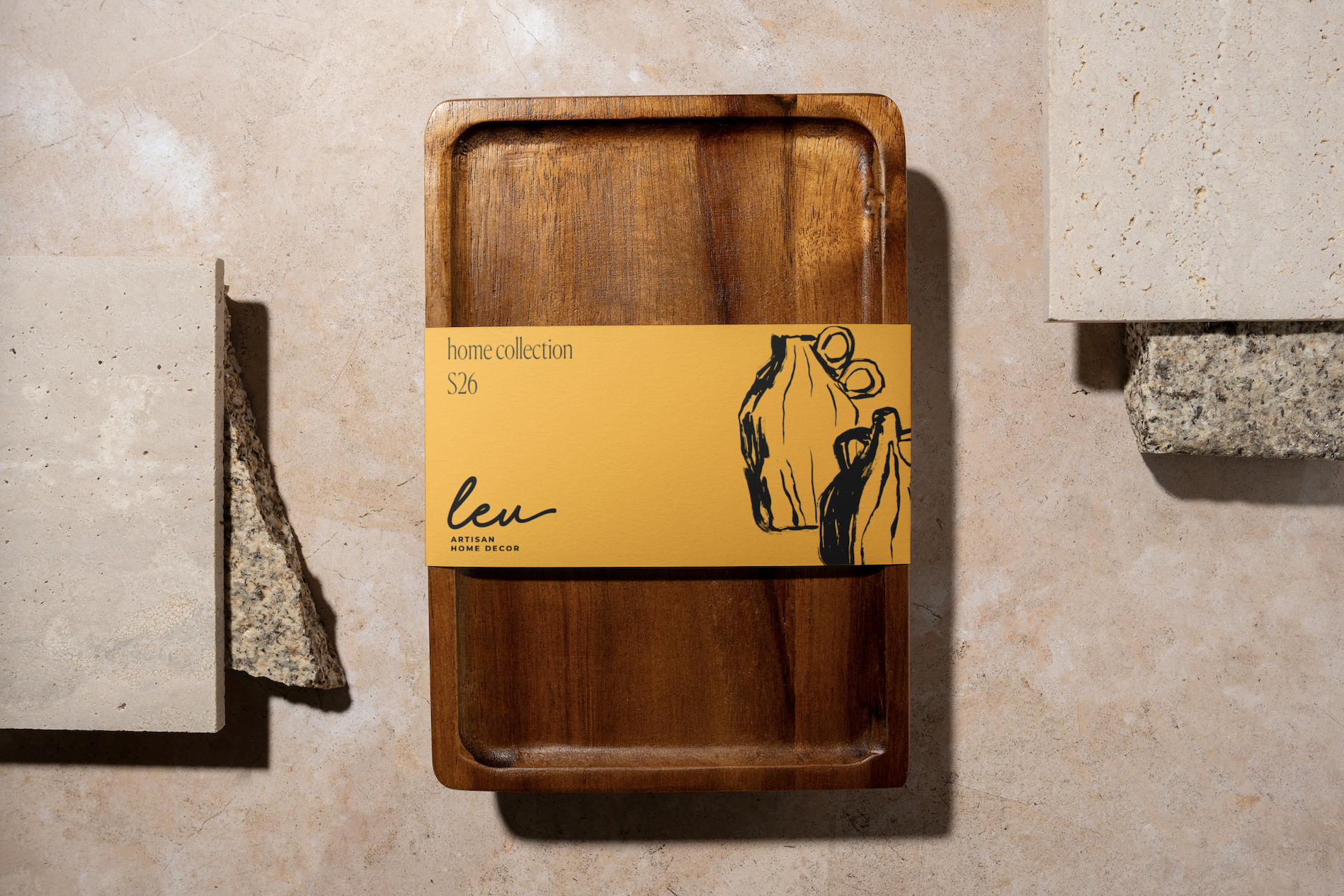
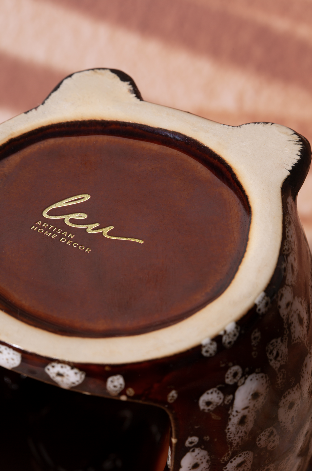
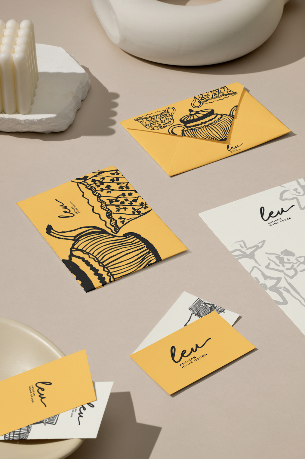
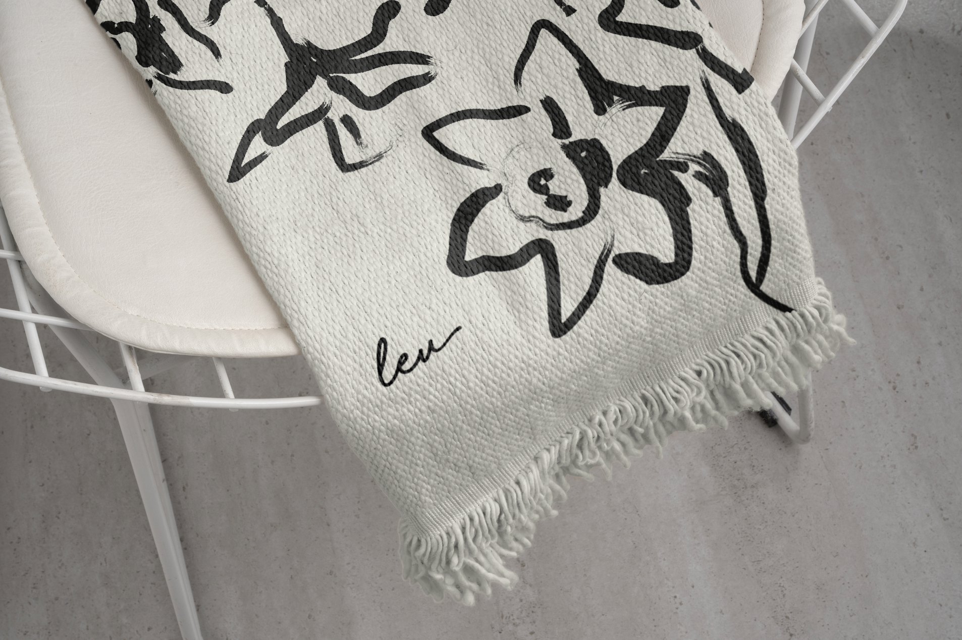
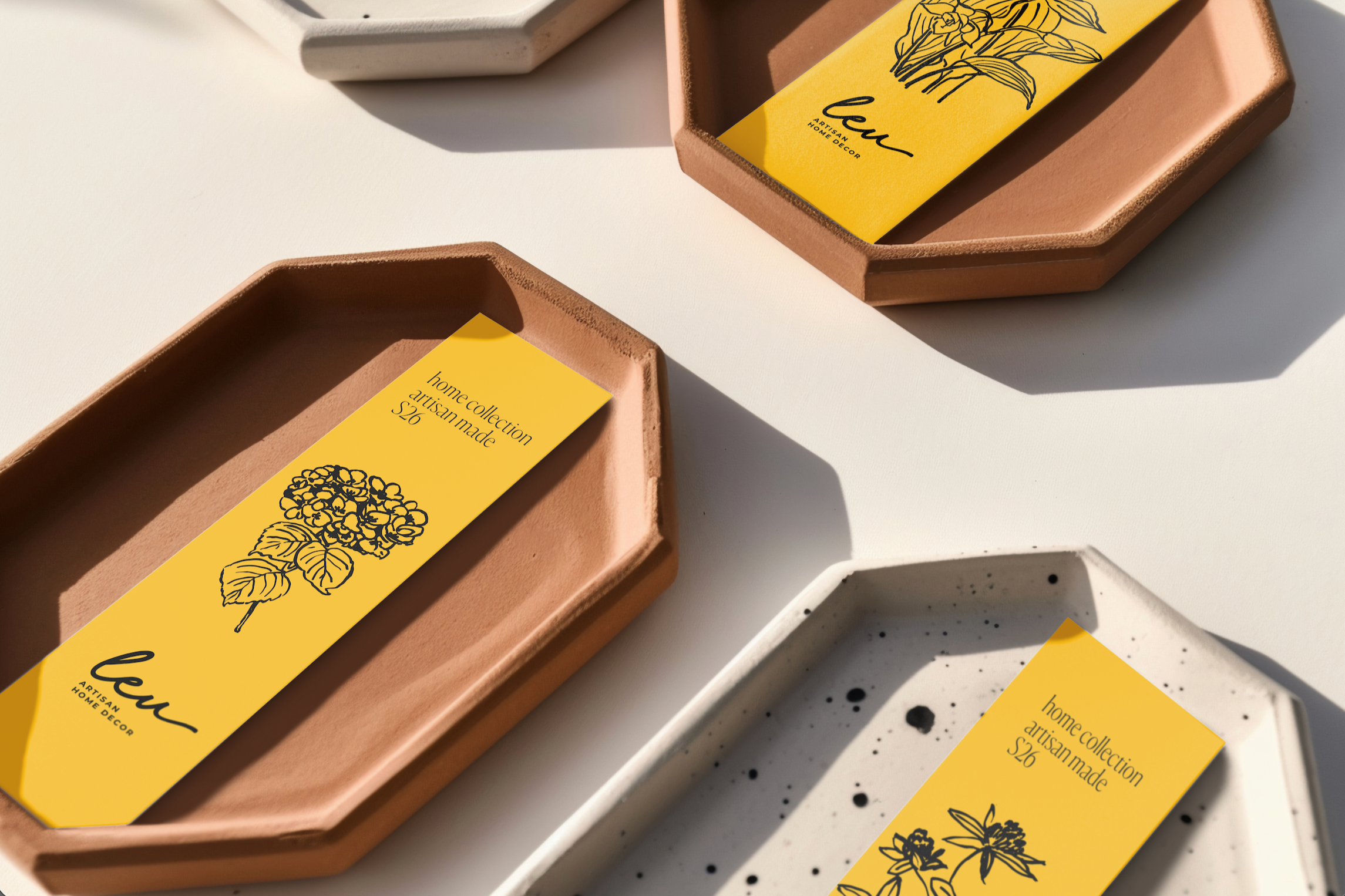
The logo could not exist as a purely decorative element. It had to live by hand. It needed to be drawn freely on paper, embroidered onto textiles, pressed into clay, stamped on ceramic, and adapted to every surface the artisans might choose to work with. The identity had to withstand imperfection, texture, and repetition—without losing clarity, character, or coherence.
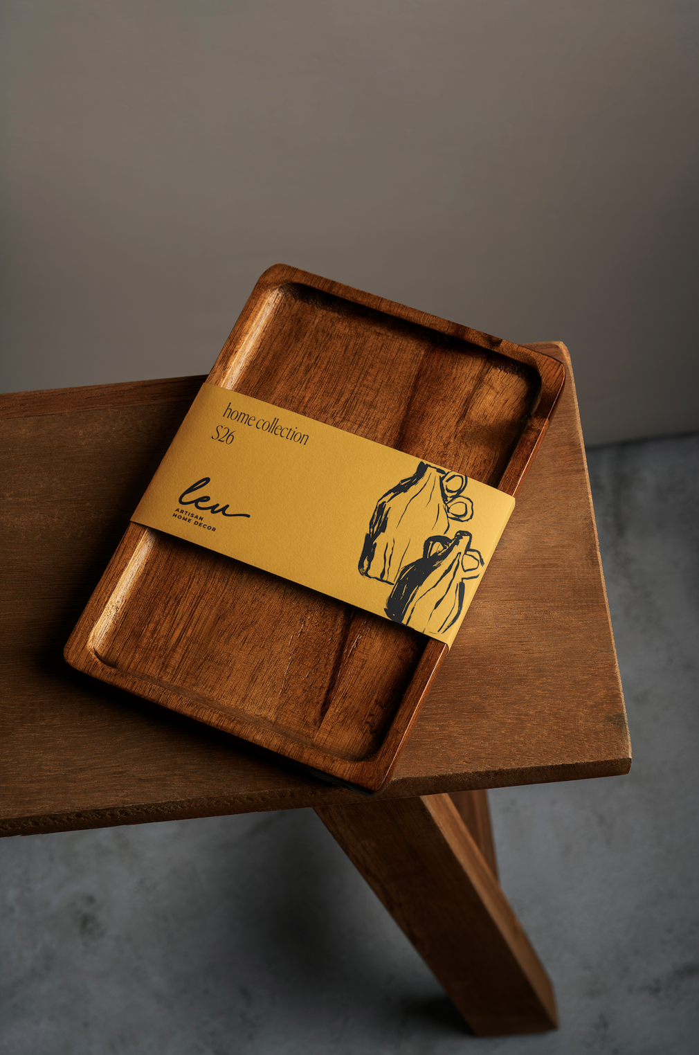
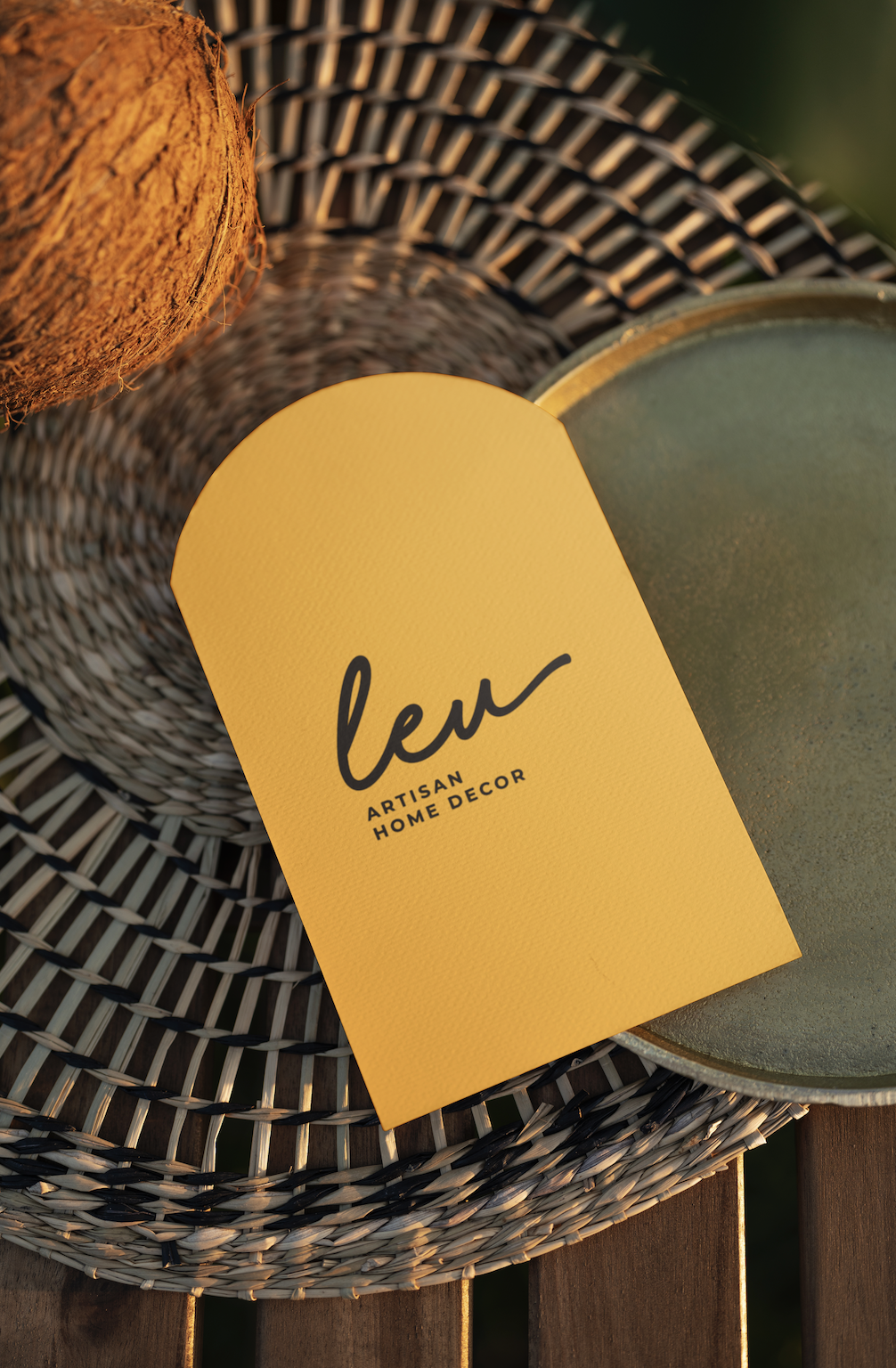
Leu is a brand dedicated to designing and crafting home décor objects rooted in materiality, process, and quiet beauty. From the outset, the visual system called for restraint rather than excess: an identity flexible enough to honor craftsmanship, yet intentional enough to feel curated, contemporary, and elevated.
Leu