Brand Identity & Packaging System
Georgetown Bakes was conceived as a quiet, confident bakery brand — one rooted in craft, tradition, and restraint.
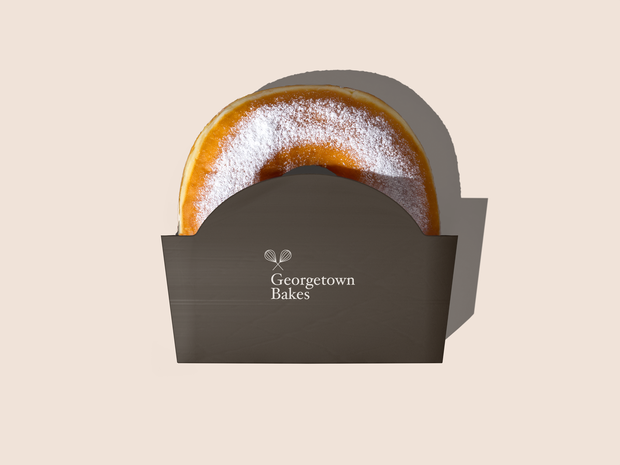
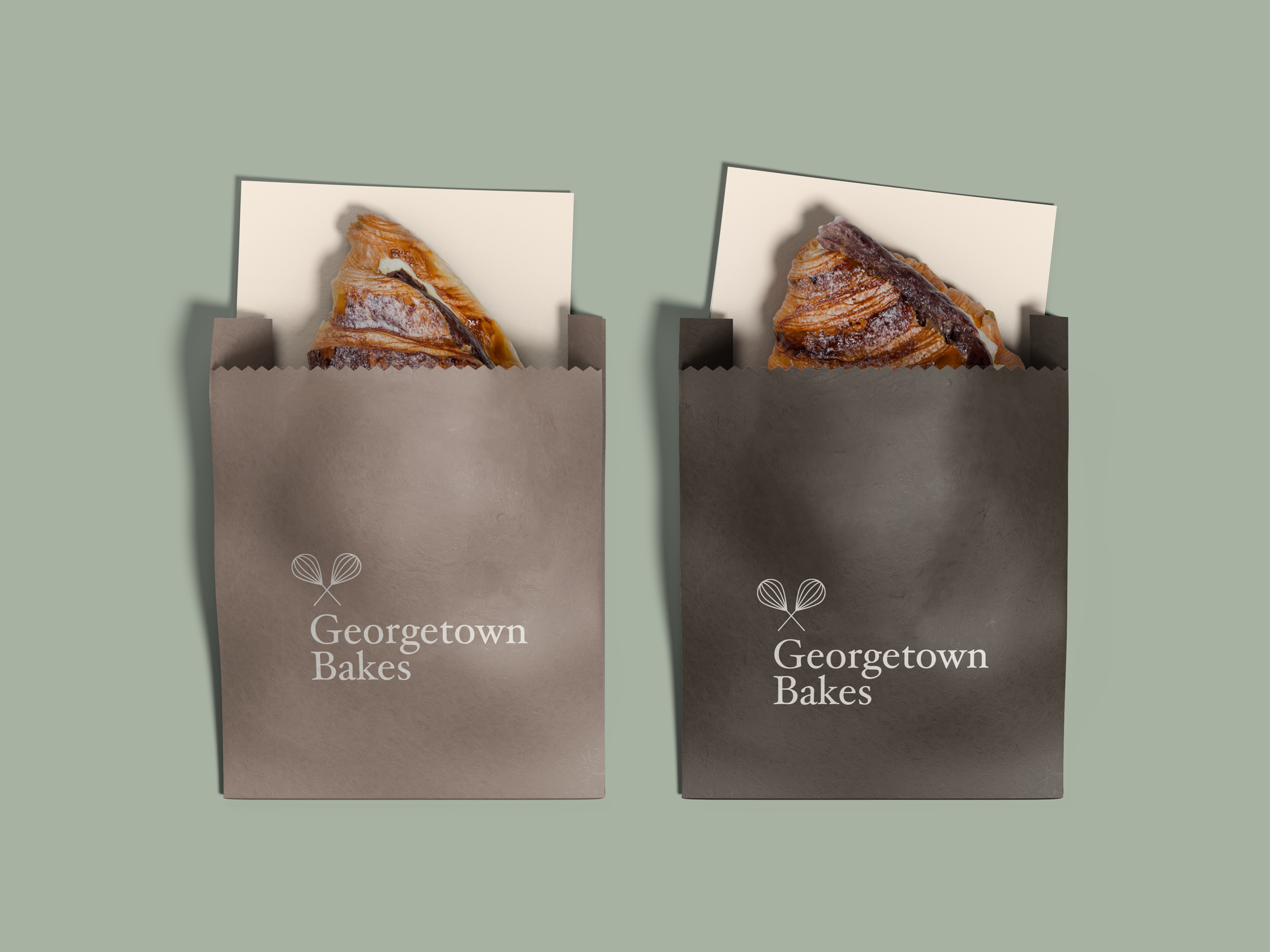
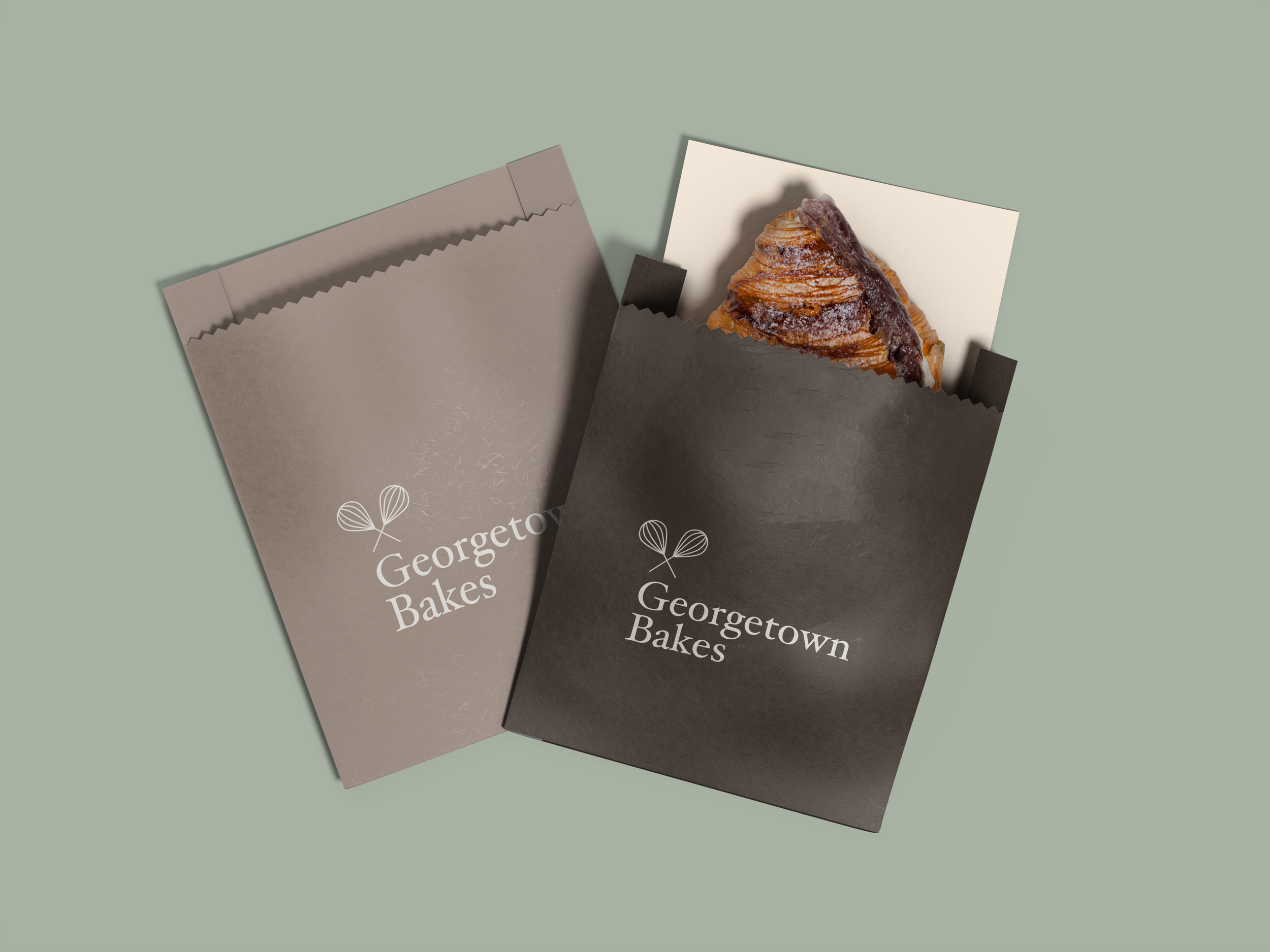
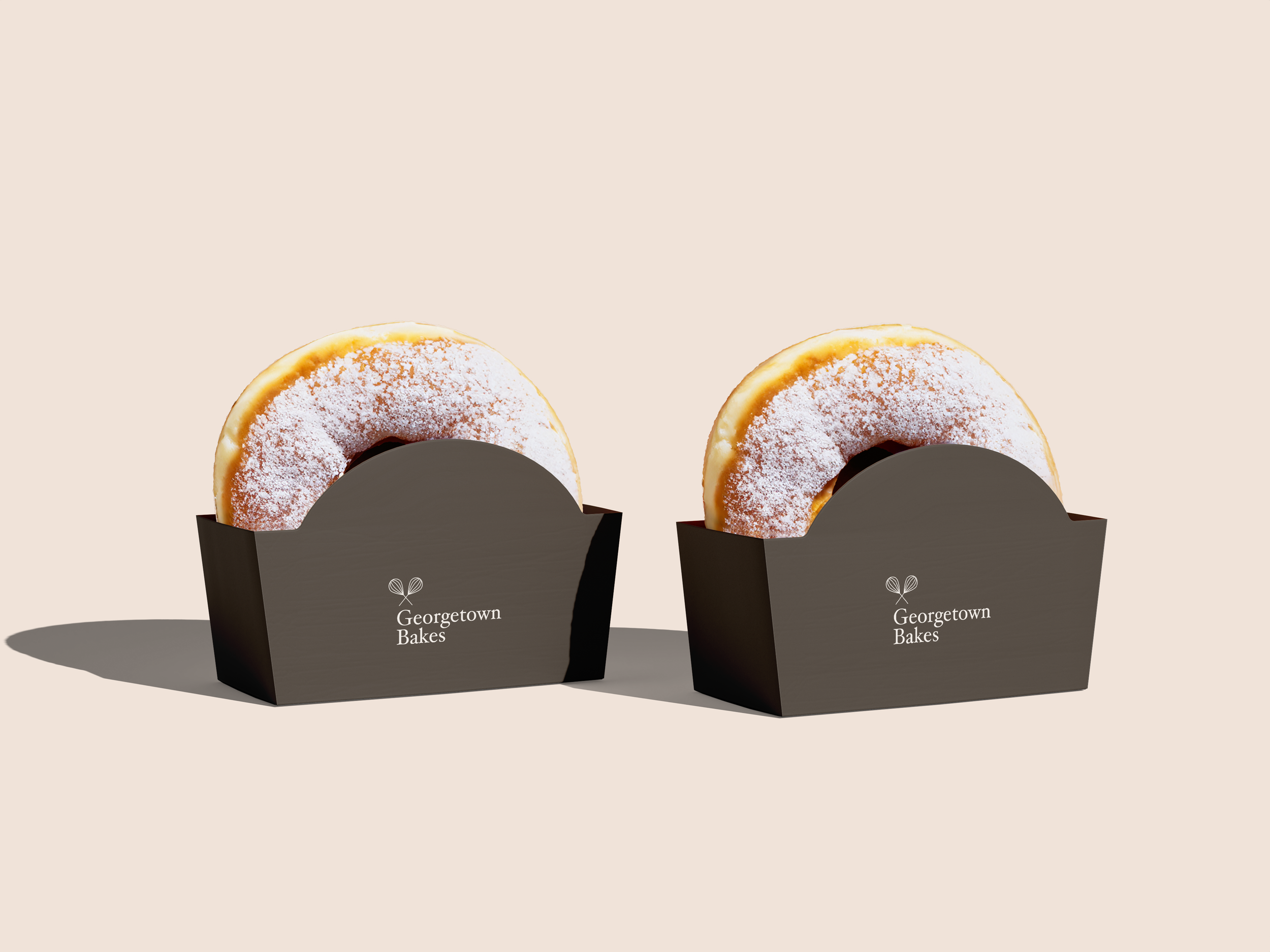
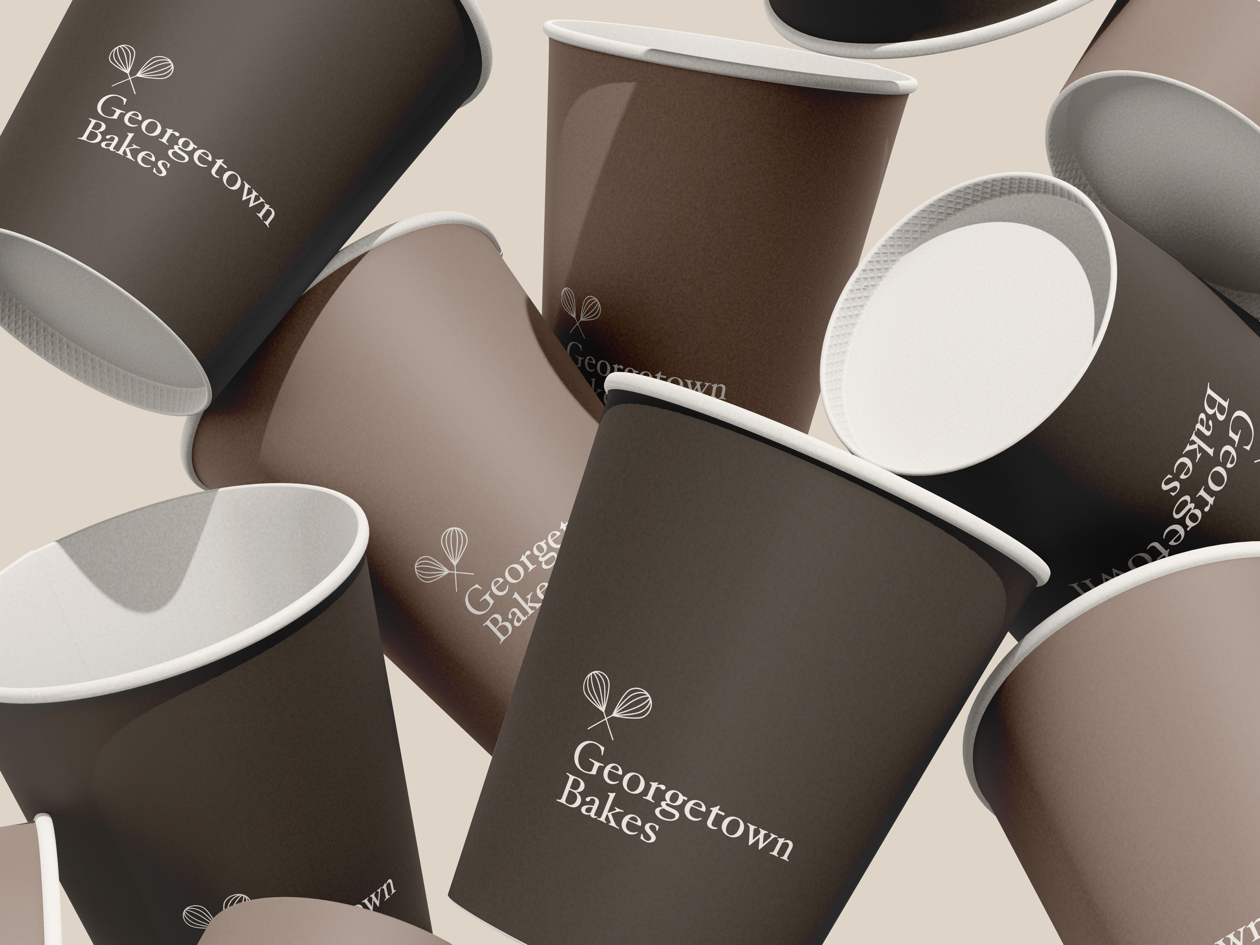
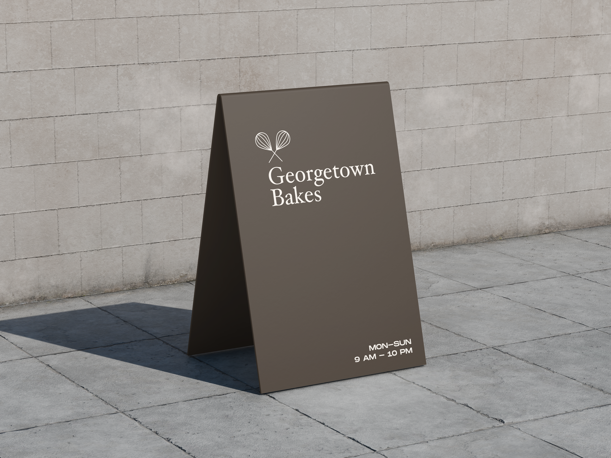
The identity draws from classic French patisserie, translated into a contemporary visual language. Warm neutrals, refined typography, and a delicate symbol come together in a system designed to feel timeless rather than trendy.
From cups and bags to boxes, signage, and tableware, every touchpoint was approached as part of a cohesive whole. The brand never competes with the product; it frames it.
The result is a calm, elegant system that feels established, trustworthy, and enduring — a bakery that doesn’t need to announce itself to be remembered.
Georgetown Bakes