Website Redesign + Creative Direction
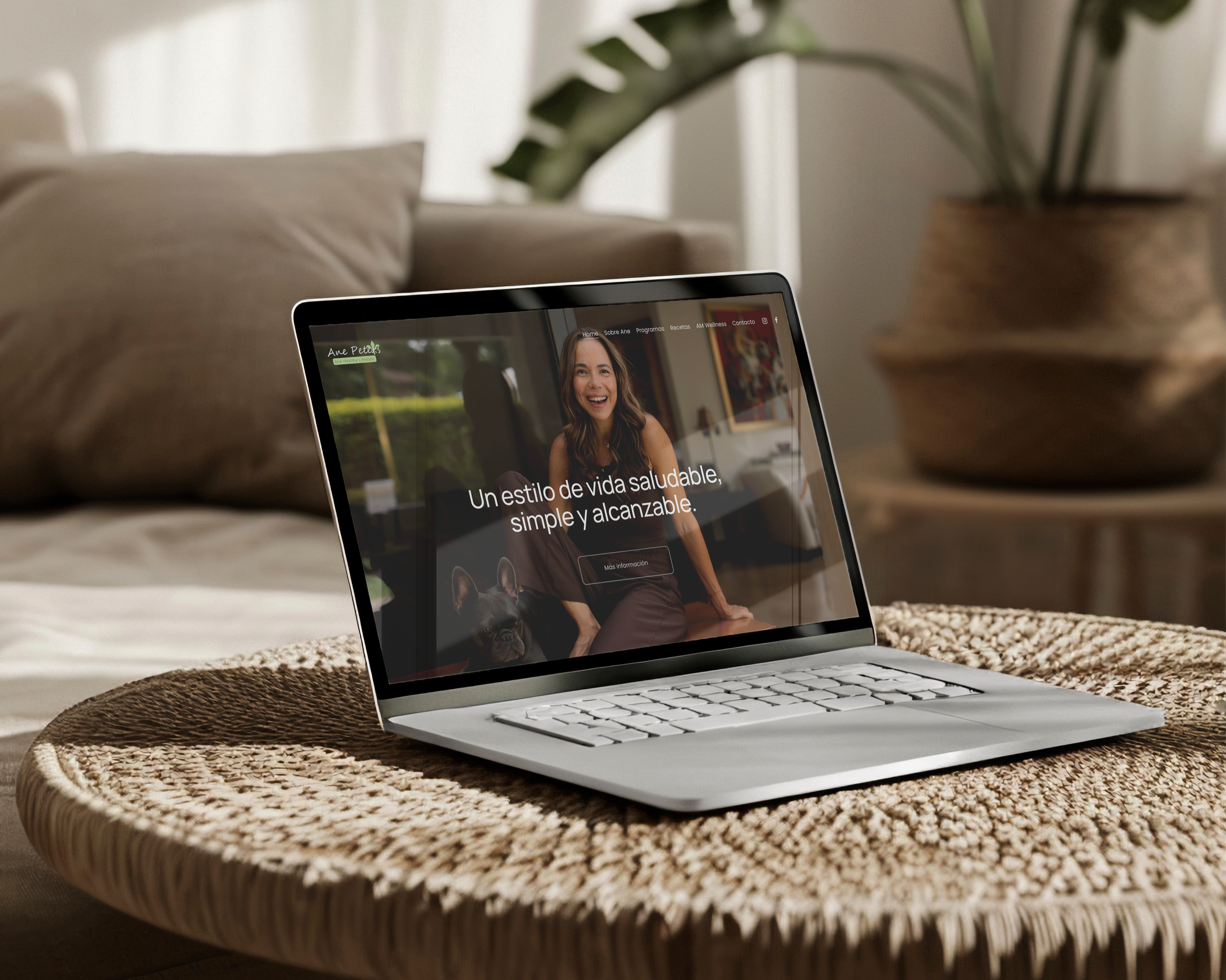
Ane Peters presented a clear challenge: a site full of valuable content, but lacking a visual hierarchy to guide the user. Too many text blocks, too many CTAs, too many directions — and no real narrative pulling it all together.
Her brand already had personality and identity. Her website wasn’t speaking the same language. Our role was to turn that noise into clarity — without losing her warmth, accessibility, and lifestyle-driven tone.
Ane Peters
Key Goals
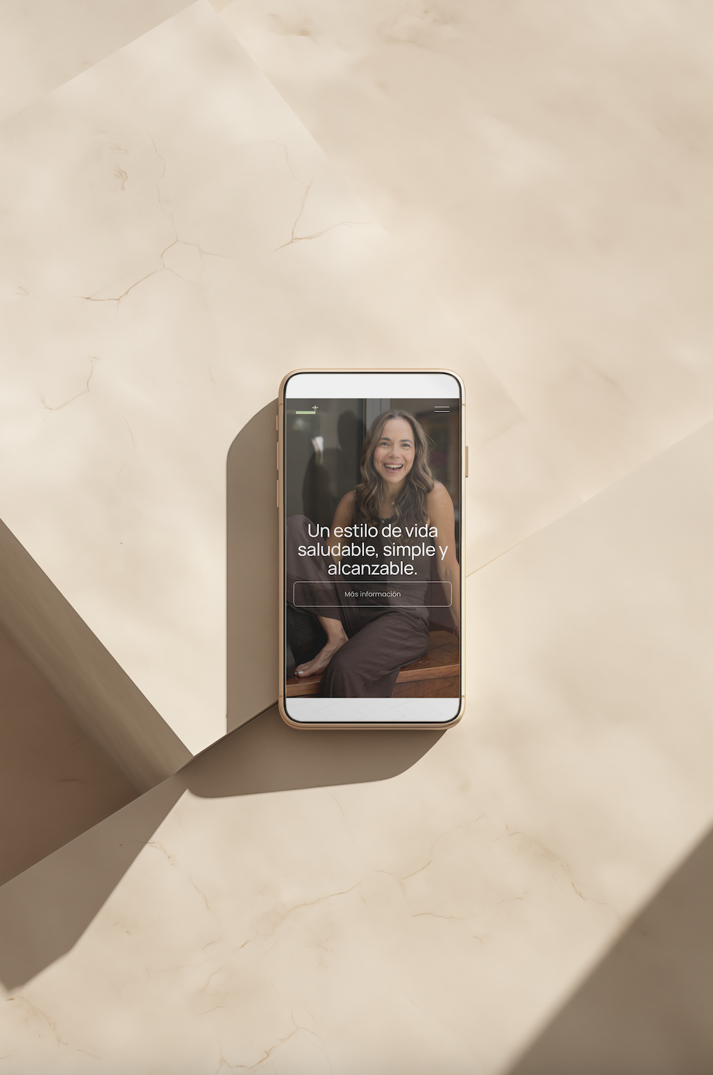
01. Trust & Brand Continuity
Ane’s essence is warmth, calm confidence, and approachability. The new site reflects that: unified photography, a cleaner aesthetic, and a visual continuity between her social media, her content, and her website.
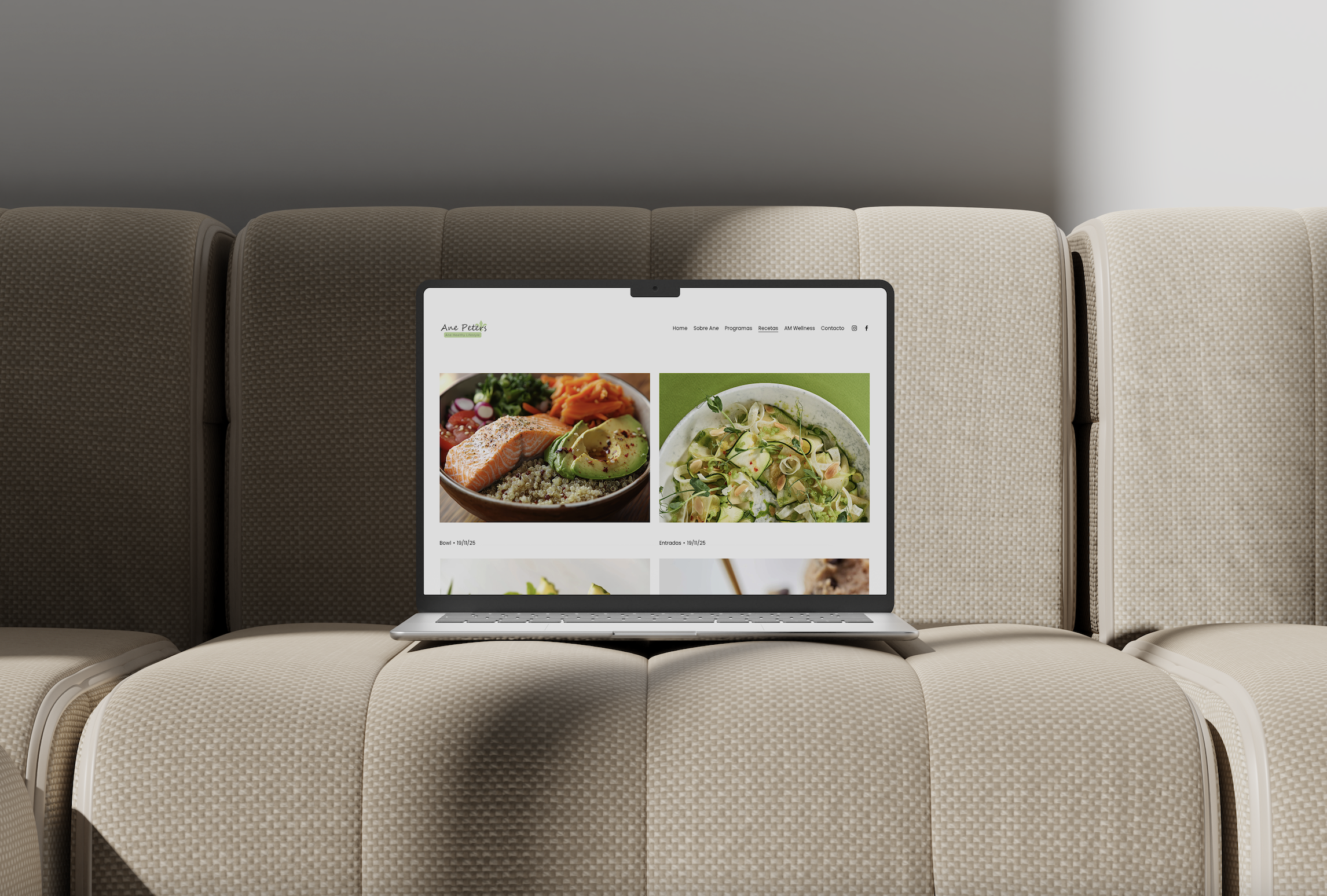
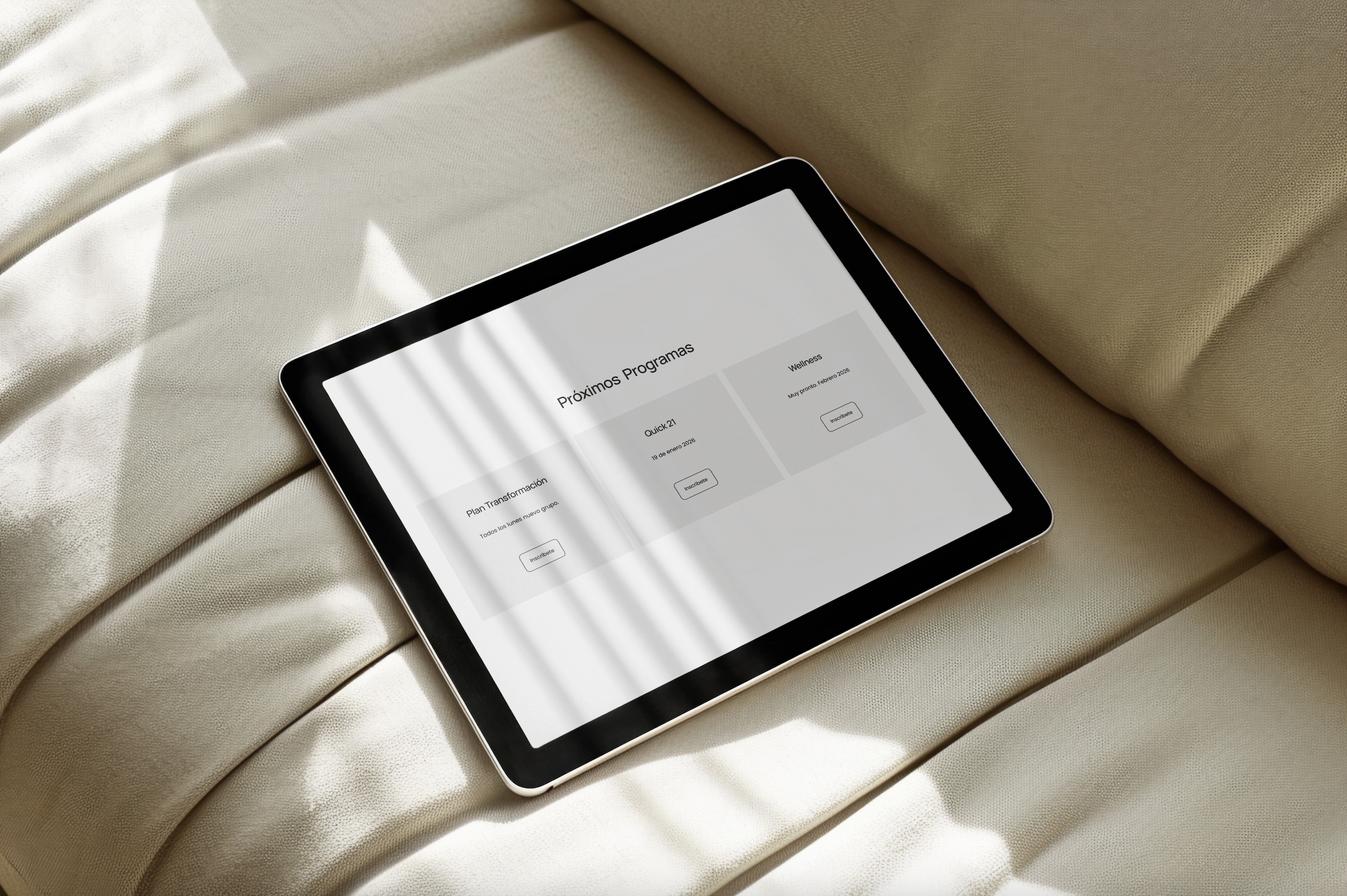
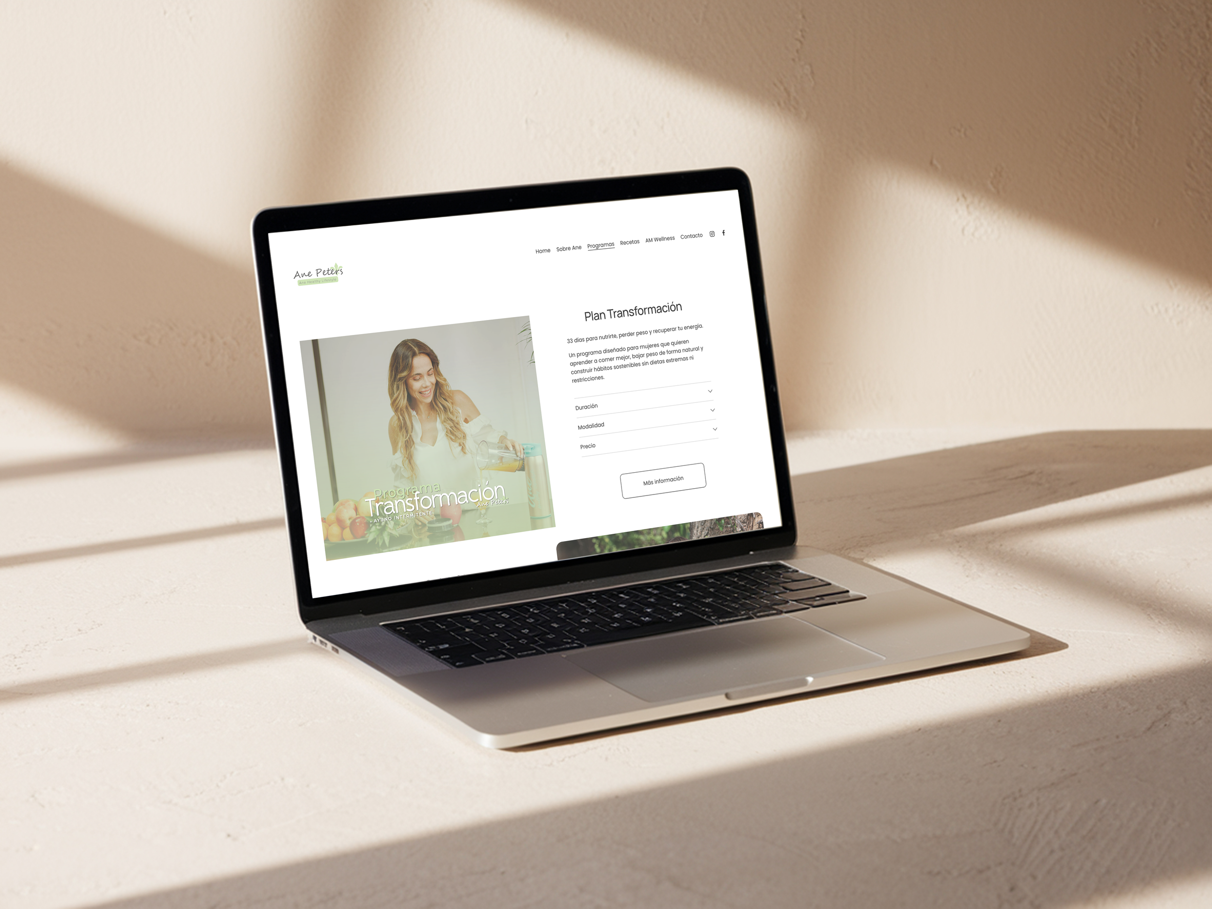
02. Clear Information on Programs
The previous layout buried essential details. Now everything is reorganized so users can quickly compare programs, understand benefits, and make confident decisions — without friction or overwhelm.
03. Optimization & Functionality
The entire site was redesigned to be easy to update, maintain, and use on both mobile and desktop. Clean design, clearer paths, faster decision-making.