Brand Identity + Art Direction + Visual System
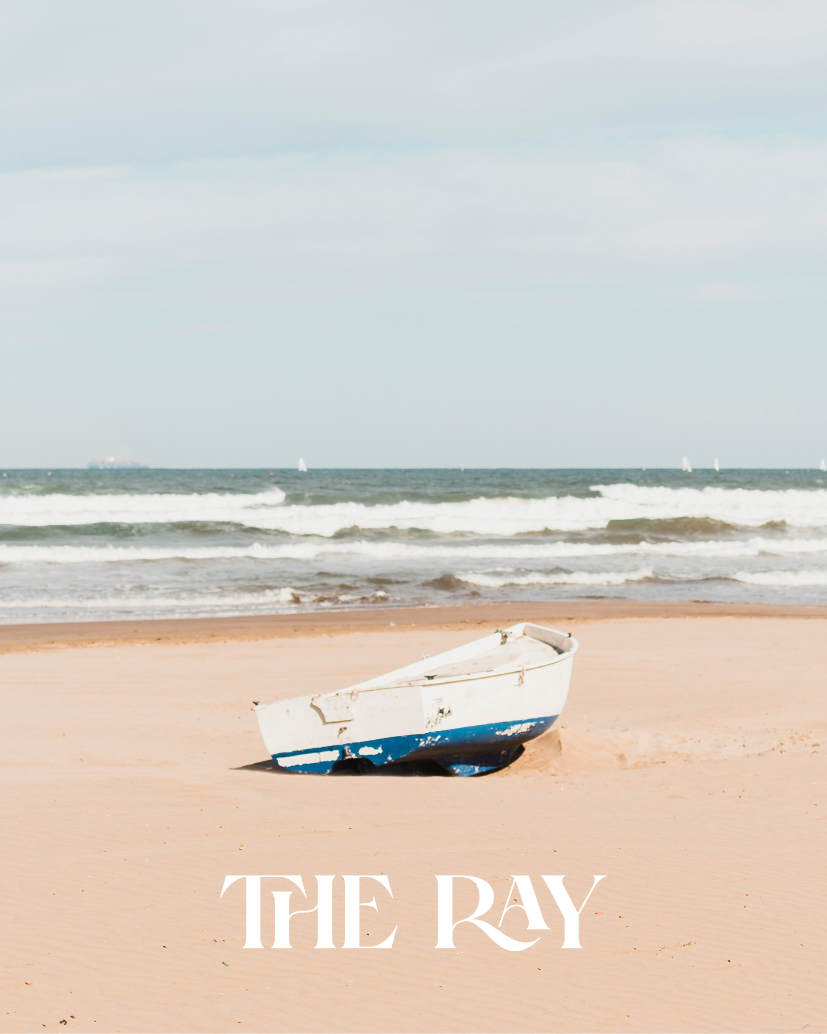
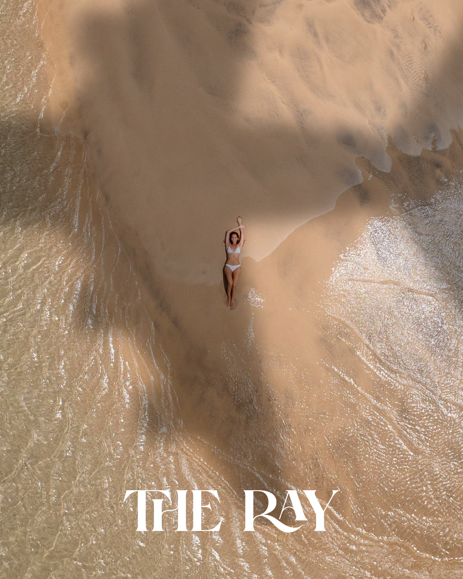
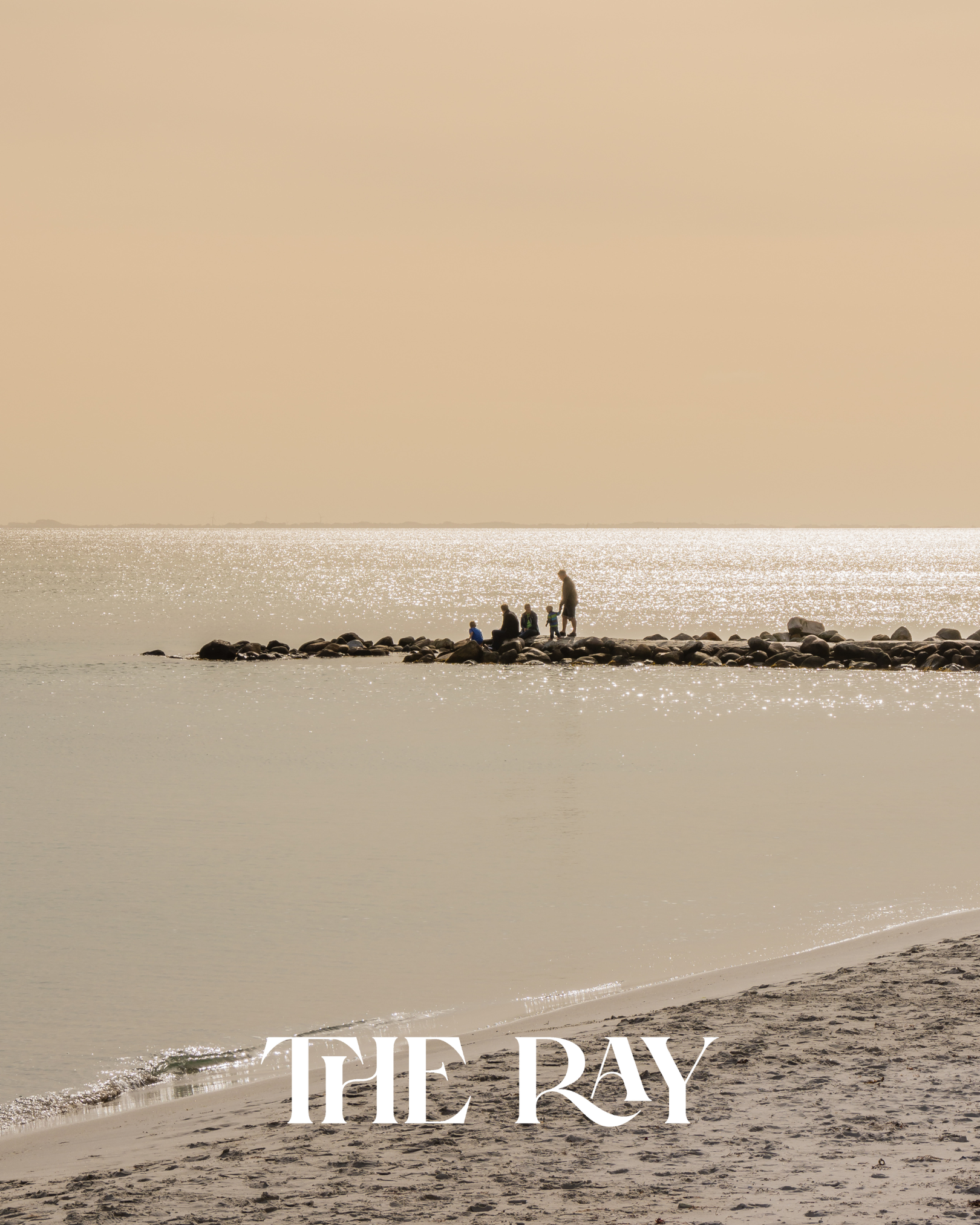
The Ray was conceived in light, calm, and understated coastal sophistication.
The challenge was clear: craft a visual identity that evokes the serenity of the shoreline without leaning on tropical clichés—a boutique hotel where luxury is quiet, sensory, and effortlessly refined.
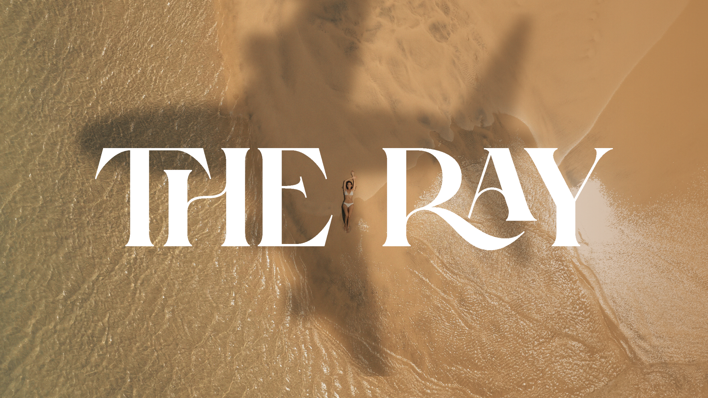
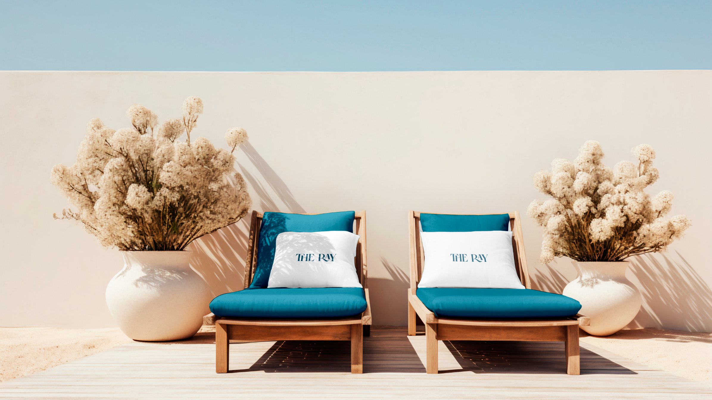
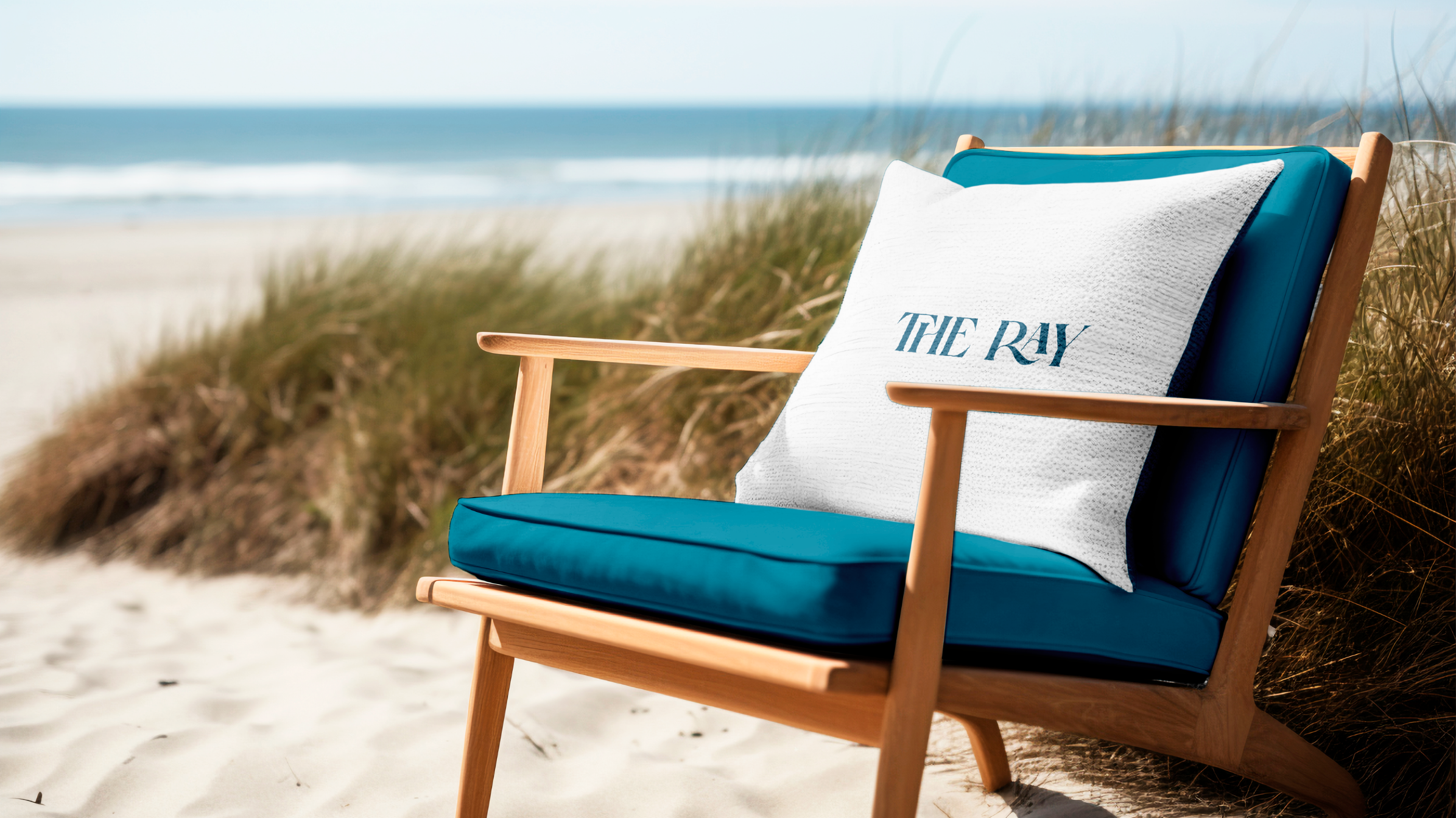
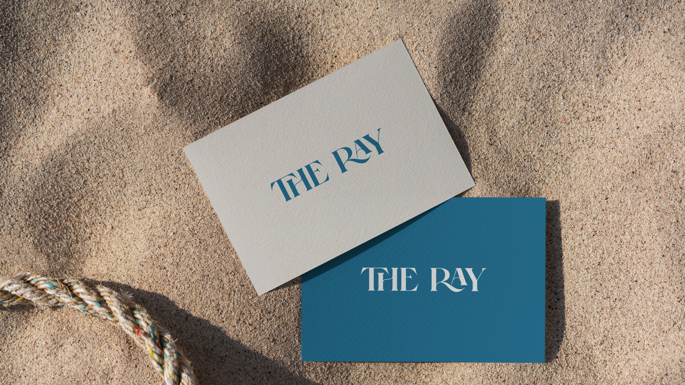
We anchored the brand in a deep turquoise hue inspired by sunlight reflecting on still water, pairing it with warm sand tones, soft off-whites, and gentle sunset accents. The result is an editorial, modern palette that feels both grounded and luminous.
The Ray
Key Goals
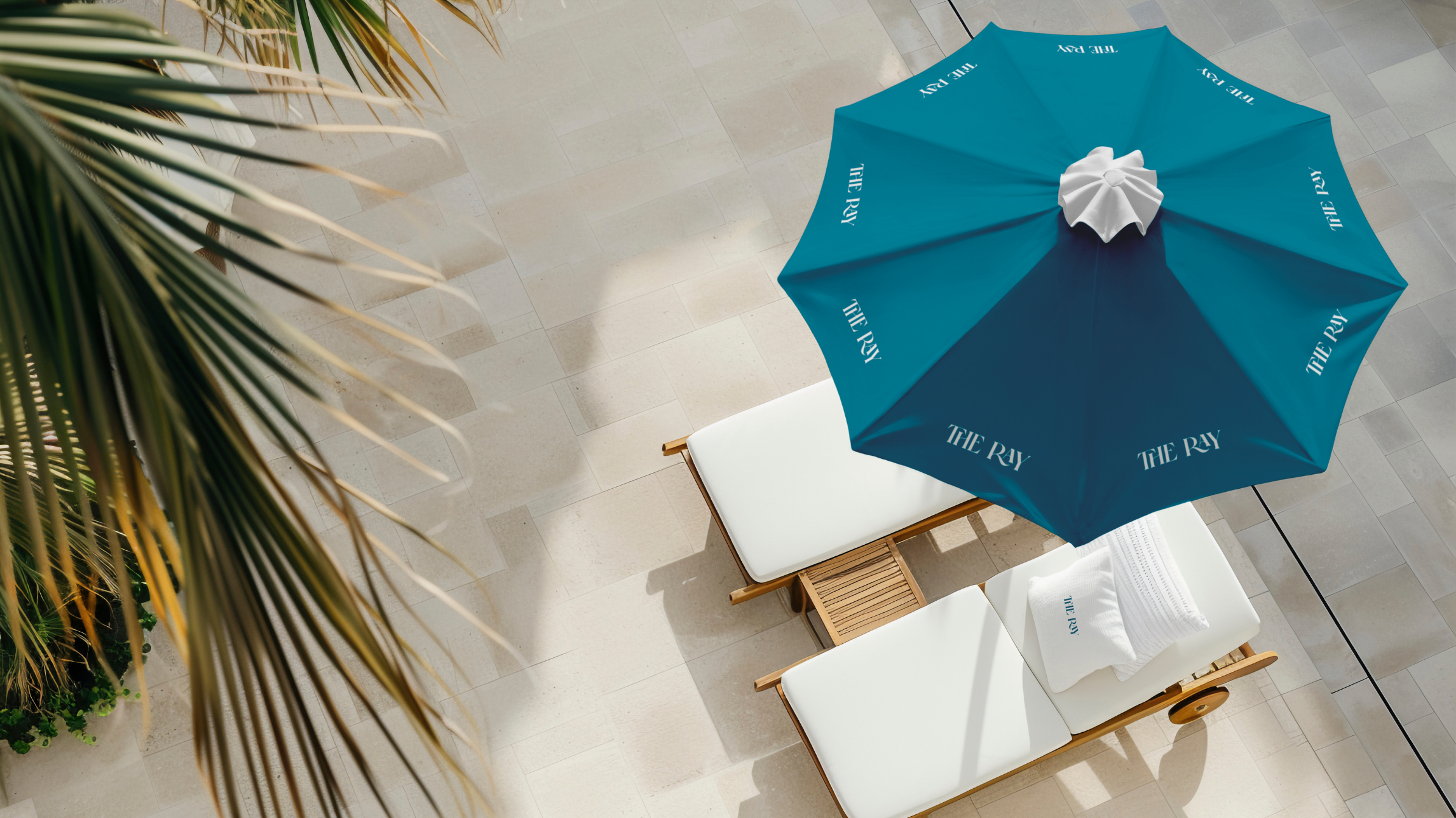
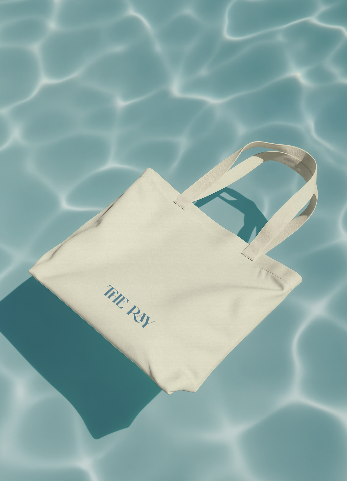
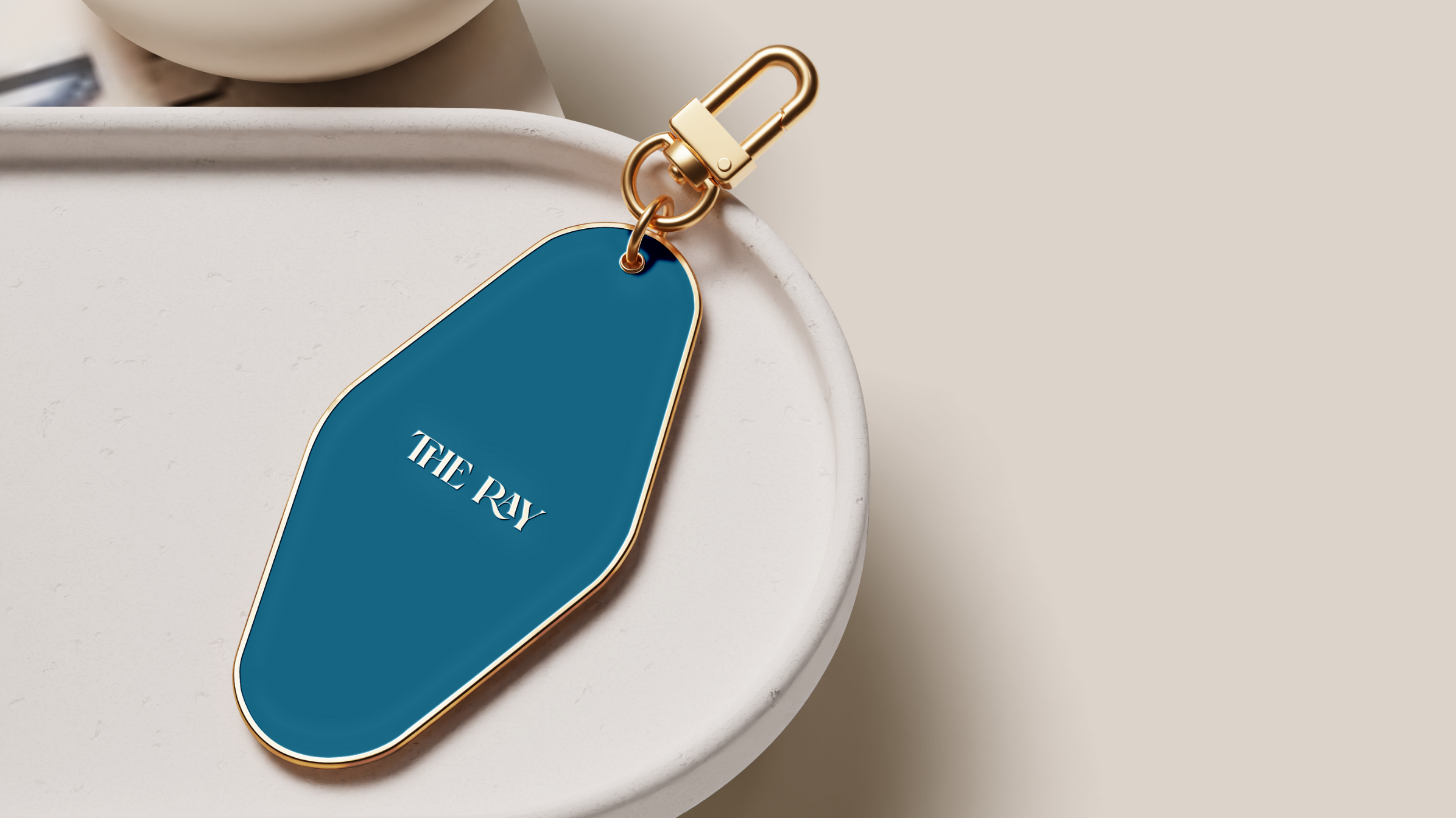
The logotype was designed with sculptural, fluid gestures—elegant enough for a boutique resort, distinctive enough to stand alone. It lives comfortably alongside natural materials: linen, ceramic, light wood, sun, and shadow. Every application—from umbrellas and cushions to key tags, amenities, and stationery—extends the atmosphere The Ray promises: a coastal refuge where light sets the rhythm.
Art direction centers on real, sensory environments: palm shadows, calm horizons, textured sand, and minimal architecture. Nothing feels loud; everything feels intentional. The Ray doesn’t shout luxury—it whispers it with confidence.
This project embodies our signature tropical-elegant approach at Capitol Circle®: brands built from sensory experience, emotional clarity, and a refined understanding of place.